SQL & data modelling
Thousands of queries against live production tables — not sample datasets. Metric definitions, data models, and the semantic layer that stops two teams reporting two different numbers.
available
Eltanbedawy.
I turn operational data into decisions people act on: SQL pipelines against live production tables, BI read daily by leadership across nine countries, and analysis that decomposes a moving number into the drivers behind it — cohorts, funnels, driver trees, segmentation, pricing simulation.
Then I build the systems that act on those numbers: ~50 n8n automation workflows in production, two AI commerce systems built for retailers in Egypt and Mauritania, and full GA4 / GTM / server-side Conversions API tracking stacks.
levels are self-assessed and evidenced. every claim below has a case study behind it
Thousands of queries against live production tables — not sample datasets. Metric definitions, data models, and the semantic layer that stops two teams reporting two different numbers.
50+ dashboards across nine countries, from 7-tab executive scorecards to a live operator dashboard readable in under a minute. Built to be read, not admired.
Decomposing a moving number into its causes: 13-month retention cohorts, booking-funnel forensics, a six-level GMV driver tree, and margin simulators with visible elasticity assumptions.
Scrapers → staging sheets → warehouse → SQL models, running daily for a paying client. Plus a full migration of an operation off spreadsheets onto a typed PostgreSQL schema.
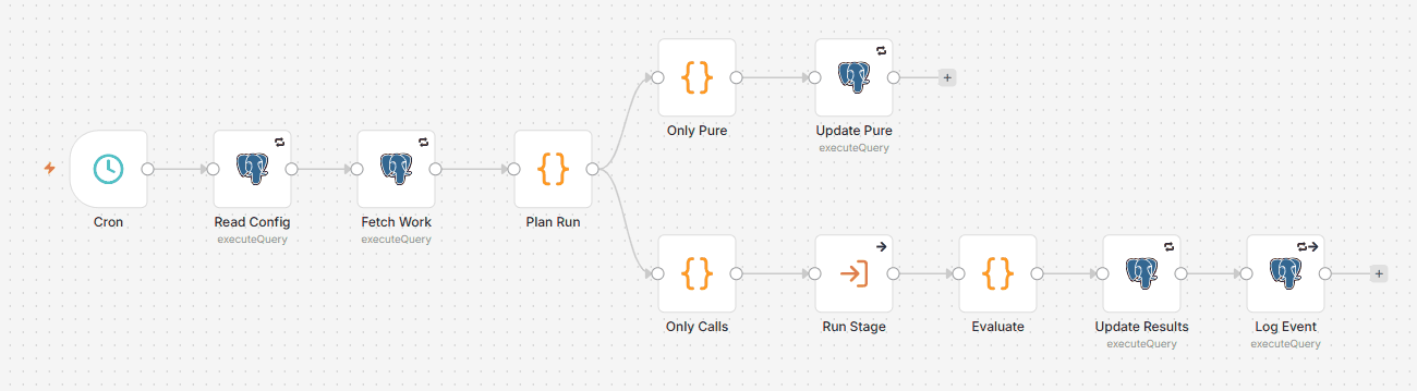
~50 production workflows with a staged pipeline, central alerting, exit-checks after every stage, and a published failure rate. Automation as a platform, not a pile of scripts.
A unified AI gateway over three providers with fallback and per-call cost logging, content pipelines with validation layers, and Arabic conversational sales agents synced to a product database.
Building tracking architectures from scratch and diagnosing broken ones: duplicated events, missing conversions, cross-domain attribution gaps — the work that decides whether any of the analytics above is true.
Client stores built and run end to end: catalog, pricing, order lifecycle, and delivery follow-up — the operational side that makes the data mean something.
24 documented dashboards across nine countries, plus the internal tooling built alongside them · click any row to open it · figures blurred by policy
Leadership had no single daily view and no way to trace a moving number to its cause. I blended eight Sheets and SQL sources into interconnected views with city and product drill-downs, then built a driver tree that decomposes GMV six levels into demand, supply, pricing and promo drivers — every node compared against the same day last week and a four-week average. Ad-hoc deep-dive requests dropped 30%.
Aggregate completion rates hide every cause. This suite splits each failure into a named mode: no offer received, offer received but timed out, cancelled before or after assignment — each across fourteen peak-multiplier brackets and distance bands, with timing medians separating “no supply” from “slow supply”. The metric glossary lives inside the dashboard so any department reads it unaided.
Thirteen-month retention cohort triangles, churn split voluntary versus blocked across six block categories, and the deepest segmentation in the stack — segment by tier by cash-block status by week. “We lost drivers” became “we blocked this many for quality, and this many left on their own” — two completely different problems with two different owners.
Acquisition spend gets judged twice — did the funnel convert, and did the users stay? Every metric renders daily and 30-day rolling side by side, so a campaign spike is never mistaken for a trend change. Beside them: a month-to-date heatmap with a column per calendar day, and a new-user retention cohort connecting each acquisition month to its afterlife.
Margin is the highest-leverage and highest-risk lever a marketplace has. These simulators answer the question before deployment: change the margin in a city, and expected trips, GMV, rider and captain subsidies, returns, waivers, COGS and net revenue all recompute — driven by one input cell, with the elasticity assumption sitting visibly in the model rather than buried in a formula.
Ops teams were managing an intraday business with yesterday’s report. Every chart overlays today against comparable days, so “is right now normal?” is answered by eye — from sessions down to utilization, with available versus active versus busy hours each defined in-view and timezone conversion documented inside the dashboard.
City averages hide everything a territory manager needs. I built zone maps for Jeddah and Riyadh from real district-composition files — with the district-to-zone mapping documented inside the dashboard so definitions are auditable — colored by a selectable metric, beside three-level hierarchical tables running from zone group down to individual districts.
The corporate billing system exported a complete list of invoices and companies every cycle, but nothing that said what had changed. I built a diff engine that matches on unique ID in both directions — catching what arrived and what disappeared — and an HTML Service review dialog that turns the comparison into a recorded Tracked / Not Tracked decision. Eleven sheets acting as an explicit state machine, with every record in exactly one state at a time.
Everything above carries client data and is published with figures blurred. These four don’t: Score Cards KPIs, Munchys Pet, Ecommerce High Level, and Ecommerce Overview are live on Tableau Public. Open them, interact with them, and judge the craft directly instead of taking my word for it.
2024 → now · where the analysis stops describing and starts acting
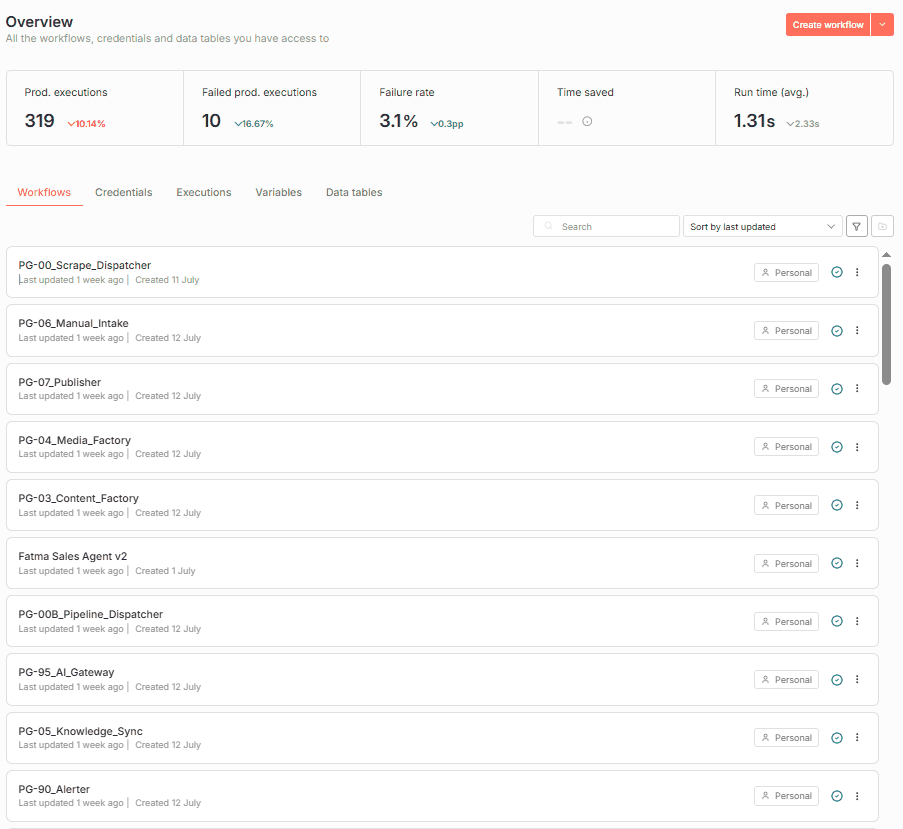
Not one clever workflow — an operating system made of them: a staged product pipeline (PG-00 → PG-95), a unified AI gateway over three providers with automatic fallback and per-call cost logging, Node.js media services, sales agents, scrapers, and a central alerter. 447 production executions in the measured period at a 9.2% failure rate — published on purpose, because a platform claiming zero failures isn't measuring.

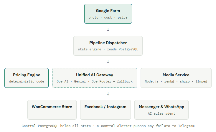
A pre-sale production system: the owner takes a photo and sets a price, and 50+ automated workflows do the rest — product intelligence, market research, AI images and video, WooCommerce listings, a monthly publishing calendar, and Messenger/WhatsApp sales agents that update instantly with every new product. Media cost under one cent per product.

The opposite half of the problem: a post-publication measurement system. Workflows pull post impressions and full ad detail into a sheet-warehouse every four hours; a chained second workflow reads the accumulated data, passes it to OpenAI, and delivers a recommendation per ad to the owner's Telegram. Spend → data → decision, with no manual step in between.

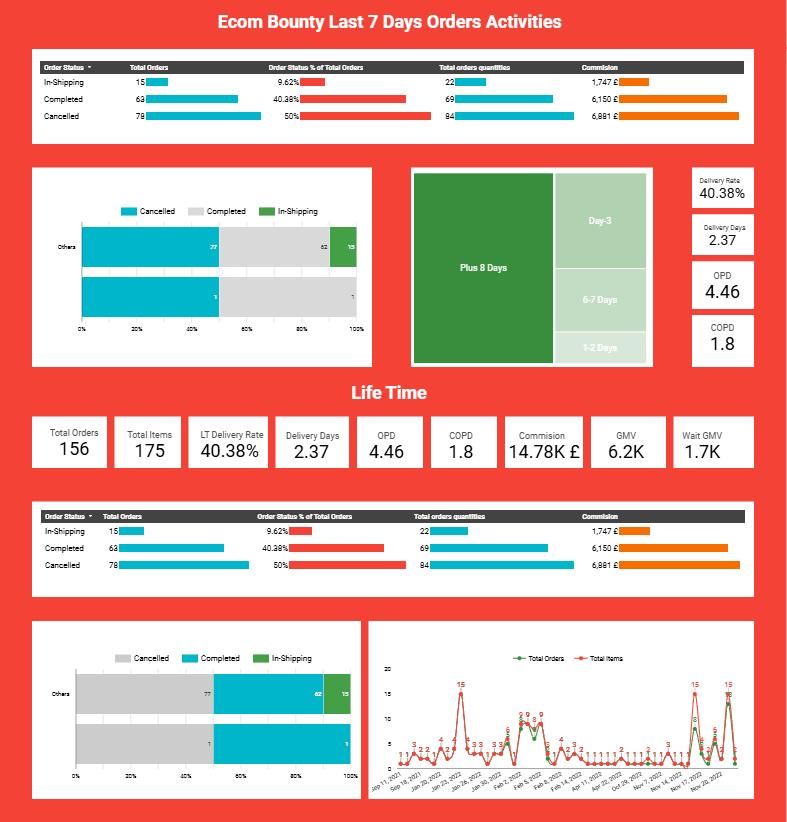
Sole operator of my own dropshipping store — 156 orders in the retained export — and the analyst who instrumented it. The dashboard's headline finding was a ~50% cancellation rate: the worst number in the operation, given the most screen space, because it was the one deciding everything else. The only piece here running on my own data.

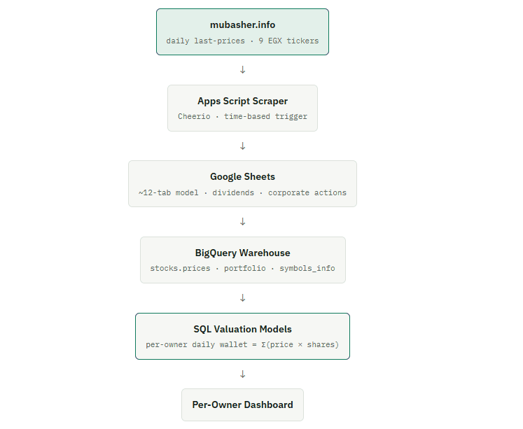
A real ETL pipeline in miniature, built for a private client and running every day: scrapers pull 9 EGX tickers into Sheets, upload jobs stream them into BigQuery, and SQL models compute each owner's daily wallet value — with dividends and corporate actions (bonus shares, capital increases, subscription rights) modeled explicitly, the part manual tracking always gets wrong.

Supplier catalogs to a published, sellable store with humans only approving: stateless Puppeteer and REST adapters for two supplier platforms behind one contract, deterministic pricing, an image pipeline (background removal + Arabic discount banners), and an Arabic Messenger sales agent. The engineering proving ground for the Commerce OS.
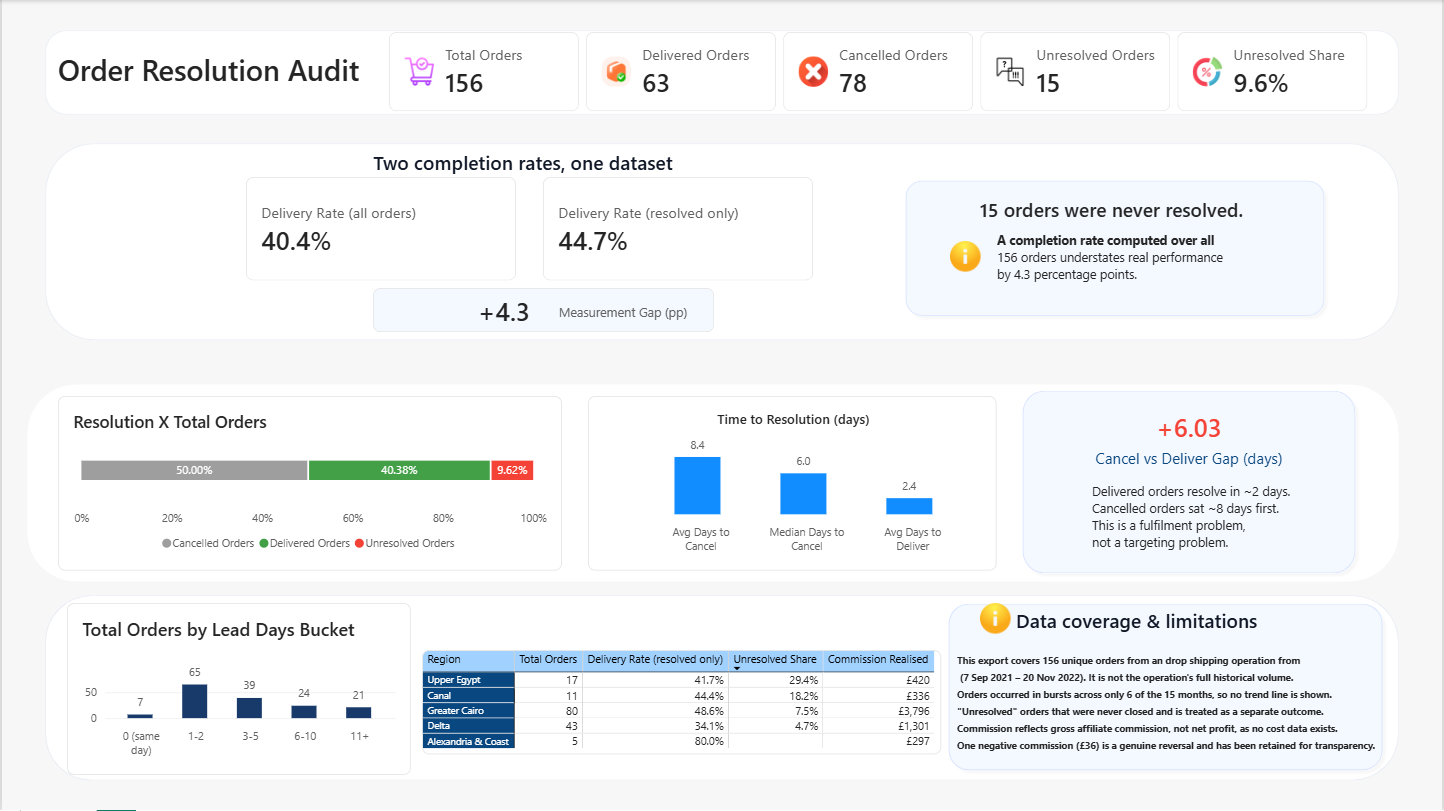
The measurement half of Jotia, rebuilt in Power BI on the 156 orders that survived in exportable form. Two findings the operation never saw: the completion rate everyone would quote was understated by 4.3 points because 15 orders were never resolved, and cancellation happened 6 days later than delivery — making it a fulfilment problem, not a targeting one. £6,881 was lost to cancellation against £6,150 actually earned. Star schema, 35 DAX measures, a what-if recovery simulator, and 20 of 20 figures reconciled to source before publishing.

2012 → now · every role, with details on demand
Personnel administration for a manufacturing workforce: employee records and contracts, attendance and leave tracking, payroll inputs, and government/labour-office paperwork — the same factory operation after the Nestlé ice-cream business transferred to Froneri.
Day-to-day HR administration on a multinational factory floor: maintaining personnel files, processing attendance and shift records, supporting hiring and onboarding paperwork, and handling employee requests — my first exposure to operational data at scale, in spreadsheets long before dashboards.
Front desk on a five-star Nile cruise: guest check-in and check-out, reservations, folios and billing, and handling requests from an international guest list in English — service operations where the standard is set by the guest, not the process.
Where the numbers started: journal entries and ledgers, invoices, payables and receivables, bank reconciliations, and monthly closings. Accounting is the original discipline of making figures reconcile — the habit that later made metric definitions and data models feel familiar.
degrees, certificates, paid programmes, and the parts nobody certified · click any row for the syllabus
Four years of accounting: ledgers, reconciliations, and closings. The original discipline of making figures agree — which is what metric definitions and data models turn out to be.
The complete Data Analysis path under the Egypt FWD scholarship, taken across three stages in one year.
Structured, hands-on practice with an audit trail — every course and project completed under my name, verifiable on the platform.
Tracks completed
Applied DataLab projects
Google’s end-to-end analytics certificate, from asking the right question through cleaning, analysing and sharing — with the R programming course completed alongside it.
A selective, project-based programme: applications were filtered and only accepted candidates enrolled. Everything was taught, then rebuilt live on a real eCommerce project rather than slides. Despite the name, the bulk of it is measurement engineering and data reading — which is exactly why it’s here.
Three hands-on DIY workshops covering the technical stack behind a commerce operation, each rated 4.88–5.00 by attendees.
[DIY] WooCommerce Store — building a professional store end to end
[DIY] Landing Page Workshop — pages built to convert
Hosting, Domain & Email Management — the infrastructure layer
A paid programme on running eCommerce as a repeatable system — the operating side of the business that sits underneath the analytics.
The digital marketing track under the Egypt FWD scholarship — the measurement and channel fundamentals that the tracking work later built on.
Teaching the same material I taught myself, to working professionals — the fastest way I know to find out whether you actually understand something.