Case Study · My Own Operation · Power BI & Data Modelling
Jotia Order Audit — Measuring My Own Operation in Power BI
I ran a dropshipping operation as owner, operator, and analyst. This is the Power BI audit of its order lifecycle, built on the 156 orders that survived in exportable form: a star schema, 35 DAX measures, a what-if recovery simulator, and a completion rate that turned out to be understated.
The interesting finding was not the cancellation rate. It was that the number everyone would compute was wrong — and that cancellation happened late, which changes who owns the problem.
Power BIDAXStar Schema
What-If ParametersData Quality AuditOwn Data
case scorecard — verified against sourcemy own data
156
unique orders, zero duplicates
6
tables — star schema, 4 relationships
35
DAX measures in 7 folders
20/20
figures reconciled to source before publishing
This is my own operational data, not a client's and not a sample dataset. Every figure on this page can be recomputed from the source export.
01The Question
I built and ran a dropshipping store for roughly eighteen months in Egypt: sourcing inventory through an affiliate supplier platform, running the ads, handling the orders. Cash on delivery, which in this market means a meaningful share of orders never complete. I knew the cancellation rate was bad. What I did not know was why, or what it had actually cost.
Two questions, one dataset: is the completion rate I would quote even correct — and is cancellation a marketing problem or an operations problem?
02The Data — Including What Is Missing
The operation ran longer and carried more orders than this export contains. What survived in exportable form is 156 unique orders between 7 September 2021 and 20 November 2022. I am publishing that number rather than the larger one I cannot evidence.
Bursts, not continuity: only 6 of the 15 calendar months in the range contain any orders. That single fact removes the trend line from the entire report — a line drawn across nine empty months implies movement that never happened.
No cost data: commission is gross affiliate commission, not net profit. Margin analysis is therefore out of scope, and the report says so on its face.
Anomalies retained, not cleaned: one order carries a negative commission of −£36 — a reversal. One order contains two line items in a single field. One governorate appeared under two spellings. The first two are flagged in the model with boolean columns; the third was normalised.
Publishing the limitations was a deliberate choice. A dashboard that presents 156 orders as if they were a complete history is not a smaller lie than one that invents them.
03The Model
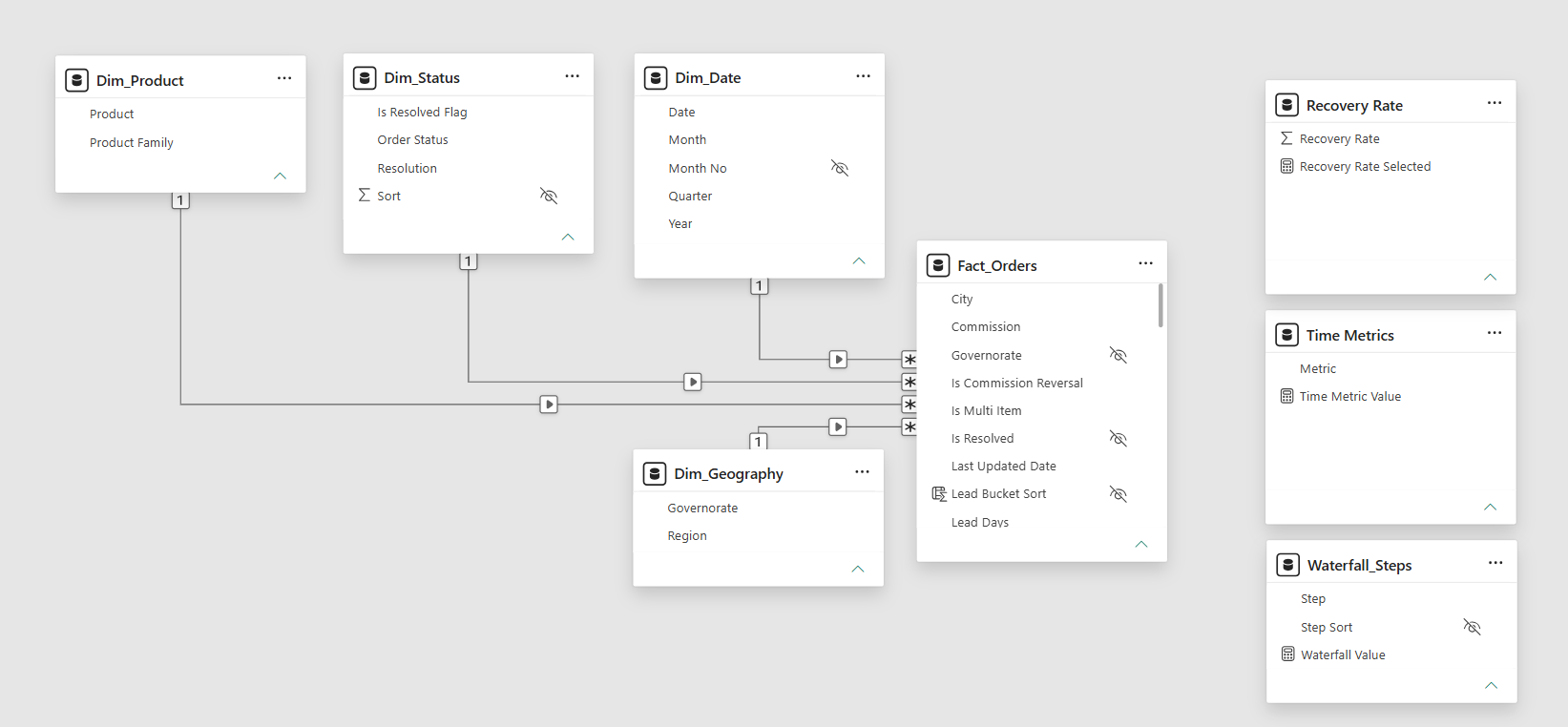
A proper star schema rather than one flat table — because the point of this build was to demonstrate modelling, and because a flat table makes half the measures below impossible to write cleanly.
Dim_Date
456 rows · marked as date table
↓
Dim_Status
3 rows · manual, for controlled sort
Dim_Geography
22 governorates → 5 regions
↓
Dim_Product
7 products → 4 families
plus three disconnected tables — a what-if parameter, a waterfall step table, and a timing-metric selector — deliberately unrelated to the fact
The third outcome: the source had three statuses — Completed, Cancelled, In-Shipping. But an order last touched in November 2022 and still marked "In-Shipping" is not in transit; it was abandoned. I mapped it to a third resolution, Unresolved, rather than folding it into either success or failure.
Volatile columns removed: the export carried "days from creation to today" fields that recompute every time the file is opened. Numbers that change daily for no business reason do not belong in a historical report.
Implicit measures disabled: every numeric column is set to summarise as None, so nobody can drag a field onto a visual and get a meaningless sum. Auto date/time is off.
04Finding One — Two Completion Rates, One Dataset
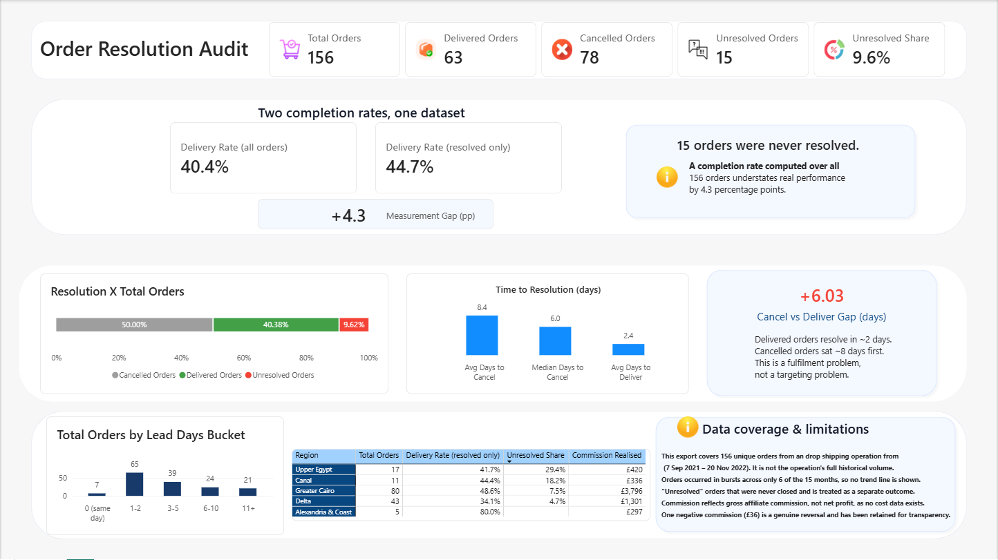
Fifteen orders were never resolved. Any completion rate computed over all 156 puts those fifteen in the denominator as though they were failures, when in truth their outcome is simply unknown.
Delivery rate over all orders: 63 ÷ 156 = 40.4%
Delivery rate over resolved orders only: 63 ÷ 141 = 44.7%
Measurement gap: +4.3 percentage points — the naive figure understates real performance by that much
Neither number is wrong. Reporting only one of them, without saying which, is.
05Finding Two — Cancellation Happens Late
This is the finding that changes what you would actually do about the problem.
Average days to deliver: 2.37 (median 2, maximum 11)
Average days to cancel: 8.40 (median 6, maximum 90)
Customers who received their order received it in about two days. Customers who cancelled had waited roughly eight days first — and three orders from September 2021 were not closed out until 33, 33 and 90 days later.
If cancellation were faster than delivery, the cause would be targeting, price, or lead quality — a marketing problem. It is slower. This is a fulfilment problem, and it belongs to operations.
The geography supports the same diagnosis. Unresolved share rises steadily with distance from the capital: Greater Cairo 7.5% → Canal 18.2% → Upper Egypt 29.4%. Nearly a third of Upper Egypt orders were neither delivered nor cancelled — they were simply left.
Regional rates are shown beside their order counts throughout, because a rate computed on five orders is not a conclusion.
06Finding Three — More Was Lost Than Earned
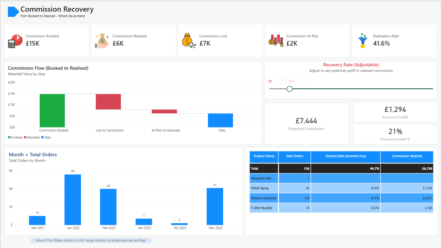
Commission booked: £14,778 across £32,978 of gross order value — a 44.8% commission rate
Commission realised: £6,150 — a realisation rate of 41.6%
Lost to cancellation: £6,881
Sitting unresolved: £1,747
More commission was lost to cancellation than was ever actually earned.
The waterfall proves the arithmetic rather than asserting it: three steps are supplied — booked, lost, at risk — and Power BI computes the total itself. That total lands on £6,150, which is the realised figure. The chart validates its own conclusion.
Beside it sits a what-if parameter. Move the recovery-rate slider and projected commission recomputes: at 25% recovery, £8,307; at 50%, £10,464; at 100%, £14,778 — back to the booked figure, as it must. It turns a static finding into a question the reader can interrogate.
07Engineering Decisions
Reconciliation before visuals: twenty figures were computed independently from the source file and matched against the model before a single chart was drawn. Twenty of twenty agreed. Building visuals on an unverified model means rebuilding them.
Dynamic titles: several visual titles are DAX measures rather than typed text, so the narration recomputes under filter instead of contradicting the numbers beside it.
Disconnected tables by design: the what-if parameter and the waterfall step table have no relationships. They are display scaffolding, not data — and a reader of the model can see that immediately.
Distributions in natural order: the lead-days histogram is sorted by a dedicated sort column, not by count. A distribution sorted by frequency is a ranking wearing a distribution's clothes.
Fixed snapshot, not TODAY(): ageing is measured against a fixed date from the data, so the report says the same thing next year as it does today.
08Skills Demonstrated
Power BI semantic modellingStar schema design
DAX (CALCULATE, time logic, dynamic text)What-if parameters
Waterfall & distribution designData quality auditing
Reconciliation disciplineHonest limitations reporting
The complete file is published with the model, the measures, and the DAX intact — open it and read the definitions rather than taking my word for any of it.